
Regional Transit & Smart Mobility
Groot Schiphol Bereikbaar
Groot Schiphol Bereikbaar is a public-private alliance improving regional mobility, accessibility, and livability across the Schiphol area by guiding employers and commuters toward sustainable transit options.

The challenge
Modernizing the identity of a regional transit authority while bringing absolute clarity to its public communication.
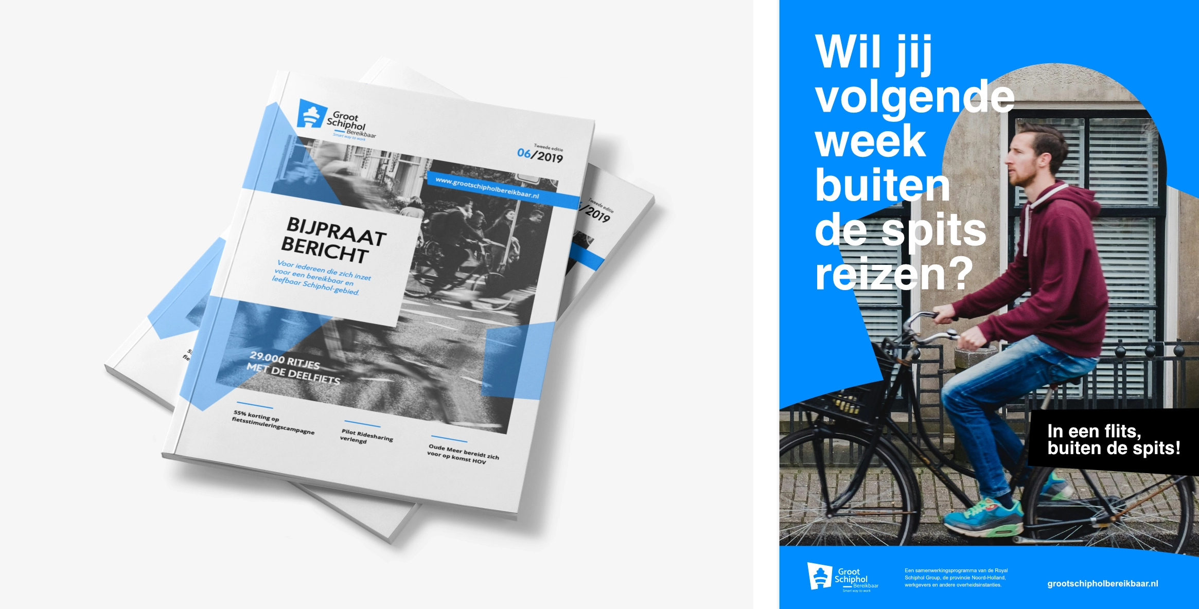
Executing a complete rebranding and editorial framework required balancing institutional credibility with public engagement. Ultra Panache architected a refreshed brand system built around a stylized geometric mark referencing Schiphol’s iconic control tower, paired with the slogan “Smart way to work.” This signature shape serves as a primary graphic anchor across all quarterly magazines, digital channels, and printed collateral.
Services Logo & Visual Identity Redesign / Brand Guidelines / Stationery & Core Collateral / Graphic Design / Annual & Corporate Reports / Social Media Visuals / Sales Brochure / Poster Design
The impact
Structuring institutional messaging to accelerate regional participation in sustainable mobility.
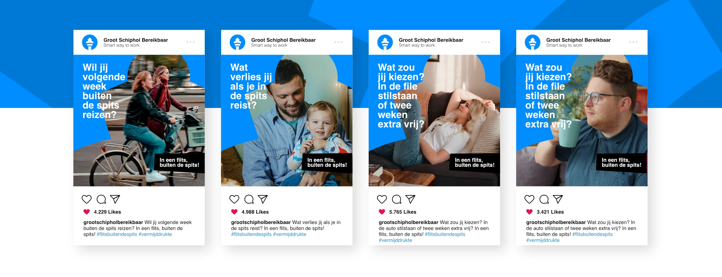
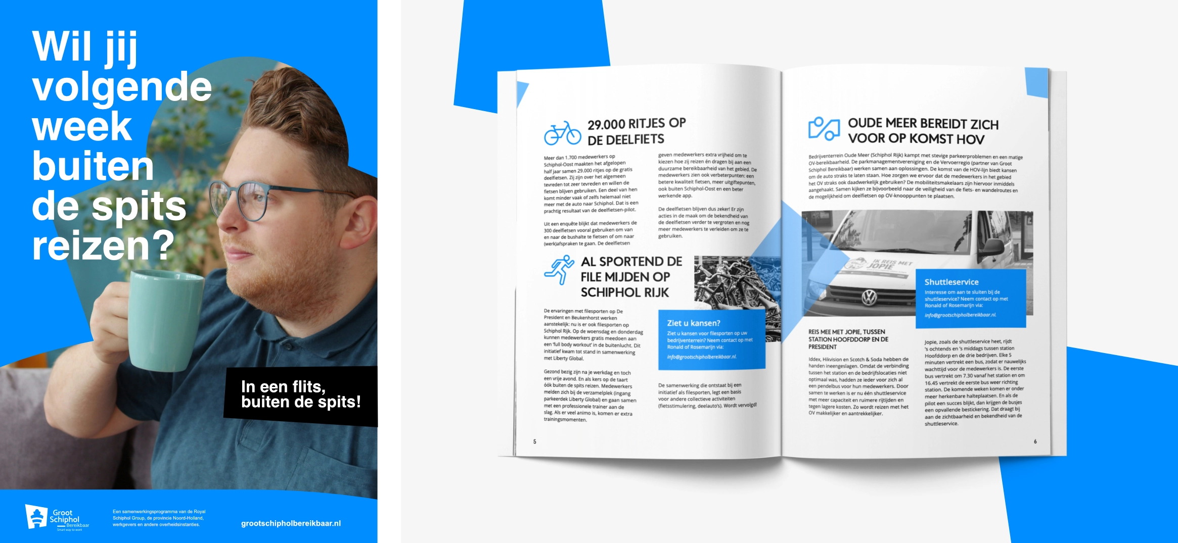
Through a unified visual territory and legible publication system, the initiative commands increased authority across the region. The seamless alignment between print magazines and digital touchpoints helps business leaders, municipal partners, and residents adopt smart commuting practices.


Ready to make your mark?
Distinctive strategy meets high-grade execution. Bring big ambitions to the table and create a brand presence defined by ultra-clarity and undeniable panache.